Arquillian logo
We are working with the jboss.org design team (actually, they are doing the work, we are just commenting on it) to create a logo for the Arquillian project (JIRA issue: DESIGN-81). Today, we met up with cheyenneweaver in IRC, where she presented us with the first round of concepts. In the first round, the logos are in black and white to focus on the concept being portrayed. Color will come later.
We've created a community poll to collect some feedback on these design proofs. Check them out and let us know what you think. That feedback will help Cheyenne steer her design process.
Here is the transcript from the IRC meeting. In this transcript, you can find some commentary from Cheyenne about each design.
Loaded log from Thu Jan 14 14:59:13 2010
* Now talking on #jbosstesting
<aslak> mojavelinux, heya dan! welcome
<aslak>
<mojavelinux> yo!
<aslak> mojavelinux, funny this mail should come today.. i was thinking about checking the status on it on my way home
<mojavelinux> absolutely. now that we have some traction and activity, we need a visual identity
I'm trying to track down the jboss.org design team...Cheyenne will be working on the logo I believe
<aslak> yea, exactly
<aslak> mojavelinux, i think it was james who did the shrinkwrap one
<mojavelinux> Cheyenne just e-mailed me and said she will be joining us here
<aslak> cool
<mojavelinux> The purpose of this "meeting" will be to give Cheyenne some concepts that we might want to have represented in our visual identity, namely the logo
We will do a couple of rounds for the logo. After the rough draft rounds, we will have some candidates to share with the community.
The way we did this with Weld worked out nicely. It was a blind poll. The comments were summarized and published as a blog entry.
We want to involve the community, but at the same time we need to decide on the visual identity that works best for us.
<aslak> pretty much the same we did with shrinkwrap.. except it was more a vote between whom ever was oneline at the time..
<mojavelinux> hehehe
cool
<aslak> mojavelinux, i presume you've seen my comment on the jira issue: https://jira.jboss.org/jira/browse/DESIGN-81
<mojavelinux> I was just reviewing it
the little man inside...hehehe
next time I get in trouble, I'm going to blame it on my Arquillian
<aslak> hehe
<mojavelinux> Cheyenne was on the wrong server...she's switching over
<aslak> ALR, you around?
<ALR> aslak: Hi
<aslak> ALR, just checking..
<ALR> Ah, we're all here.
Neat.
<cweaver> ALR: Hi there
<mojavelinux> Welcome Cheyenne!
cweaver: Hey, welcome!
<cweaver> Howdy
<aslak> cweaver, heya!
<ALR> cweaver: Have you met Aslak yet?
<cweaver> Nope, hi there
<ALR> cweaver: And mojavelinux is Dan.
<aslak> cweaver, hi your self..
<mojavelinux> okay, so we'll get started. It seems that Aslak and ALR are well versed in the logo creation process, having worked with James on the ShrinkWrap visual identity
<ALR> Yep
<cweaver> Awesome, this should be quick
<ALR> The idea is to not intrude on .org team as much as possible and let them bring it.
<cweaver> I'll just start off by saying that we usually do our first rounds in black and white
(but you guys probably know that already)
We usually stay away from color until the form of the logo is decided
<ALR> cweaver: Did you want us to seed with some ideas, or do you have some in mind to discuss already?
<mojavelinux> the idea being that we want to introduce the concept of the art first, right?
Aslak kicked off the idea pool with his post on https://jira.jboss.org/jira/browse/DESIGN-81
* rruss1 is now known as rruss|away
<cweaver> Well, I've actually jumped right into desining a first round
* ALR laughs
<ALR> Nice.
<cweaver> From the comments that were posted in the jira
<mojavelinux> perfect
<cweaver> Some of my ideas come from various metaphors, so if you guys had something very specific in mind...
I can go down that path in the second round
So let me start off with the first logo...
<mojavelinux> "remote controlling" is one concept to potential represent
<cweaver> http://labs.jboss.com/files/jbosslabs/design/arquillian/logo/images/arquillian_logo_r1v1.png
o for the first logo, I wanted to illustrate the "little man" idea with a simple head inside a head.
<mojavelinux> we don't have any preconceived notions
looking
<cweaver> The larger head's eye is closed, and the smaller head's eyes are open. If you wanted to go for more of an alien look for the smaller head, the eye could be bigger.
I went down some of the more obvious paths, but something more simple like "remote controlling" would be good for round 2
http://labs.jboss.com/files/jbosslabs/design/arquillian/logo/images/arquillian_logo_r1v2.png
Wih logo 2, I wanted to illustrate the little brain controlling the senses.
This is a more anatomical or medical version of the idea.
The italicized font also contributes to the medical feel, by treating the name as you would wth terminology.
<mojavelinux> #1 definitely gets the "remote controlling" idea across, so we are off to a good start
<cweaver> cool
http://labs.jboss.com/files/jbosslabs/design/arquillian/logo/images/arquillian_logo_r1v3.png
This, again touches on the medical illustration feel.
The ladder insinuates that a smaller independently thinking organism would have access to the brain.
<mojavelinux> remote controlling in the sense of cockpit that is...(not like a radio transmission)
<cweaver> well in that case, it's well explored
http://labs.jboss.com/files/jbosslabs/design/arquillian/logo/images/arquillian_logo_r1v4.png
With this one, I know you hadn't mentioned how the galaxy in the necklace fit into the metaphor for the project.
But I wanted to throw that out there, because I think it touches on a lot of the same ideas as the "small but powerful" controlling things.
http://labs.jboss.com/files/jbosslabs/design/arquillian/logo/images/arquillian_logo_r1v5.png
In 5, I've gone with the idea of a robot controling another robot.
The distressed effect gives it a little bit of the same kitsch feel that alien movies often have.
http://labs.jboss.com/files/jbosslabs/design/arquillian/logo/images/arquillian_logo_r1v6.png
<mojavelinux> #2 is interesting too because multi senses could also be perceived as multiple containers
<cweaver> And 6 gets into some serious kitsch
Ah, okay
I tried to stay away from spelling out the alien reference too much, but with this one I just embraced it, in all it's comic book-ish glory.
<mojavelinux> one thing that Arquillian do is take the same archive and put it into different containers to see that it behaves
<ALR> I worry about us trying to cram too much message into a logo.
For instance I really like 6.
And even 4.
Though they're lighter on the metaphors.
They are recognizable as a brand.
<cweaver> yep, simple is good when you're talking about reducing the image as well
<aslak> i like 2 and 4.. i had forgoten about the galaxy
<cweaver> http://labs.jboss.com/files/jbosslabs/design/arquillian/logo/images/arquillian_logo_r1v7.png
With 7, I wanted to go a different route and explore the puppet master metaphor.
I know it's kind of the opposite scale as "little inside the big", but it's another way of thinking about it.
<baileyje> /me likes 4
<cweaver> Last one:
http://labs.jboss.com/files/jbosslabs/design/arquillian/logo/images/arquillian_logo_r1v8.png
<baileyje> doh..
<cweaver> With this last one, I wanted to go with something simple and graphic, that also looked like kind of like alien technology..
or like you were looking at a large outer object being stripped away to revel a smaller object.
that's it
<ALR> cweaver: Do you have any favorites / why?
<cweaver> humm
I'd be happy with any of them, but I think the first one may be my favorite
It gets the point across with relatively little imagery
<mojavelinux> First off, thanks for covering such a broad range of options...so many I was having trouble keeping up
I like #1 and #4
Here are m thoughts
<cweaver> sure thing
<ALR> I really like the typeface of 8
cweaver: Agreed, first thanks.
<mojavelinux> #1 I like because it gets across very simply the idea of "remote control" which is a large part of what Arquillian does. It takes an intention and executes it inside of a host container/body
and the reason it is doing that...
<aslak> 8 is kinda close to shrinkwrap, think they could match
<ALR> mojavelinux: Agreed; I think 1 is the best metaphorical graphic.
<aslak> http://www.jboss.org/files/jbosslabs/design/shrinkwrap/logo/images/shrinkwrap_logo_450px.gif
<mojavelinux> is because it needs to allow the code to be in it's natural environment
just like the human body is a natural way to interface w/ Earthlings
<aslak> not that that's i think to match.. jsut saying
thing
<ALR> mojavelinux: So how would that play out in a small logo?
<ALR> Or reduced to favicon?
<mojavelinux> Not sure about that yet...just considering the concept first
<ALR> Mhmm
<cweaver> Well, usually with favicons, we manipulate the pixels to get the most out of them
<mojavelinux> Okay, a head could scale pretty small because it is instantly recognizable...also what is neat is that it plays into the jboss.org brain concept (just saying)
<cweaver> if you like some of the more complex ones, I can include the 16x version so you can see how it may end up looking
<germanescobar> They are all really good! My favorite is #4!
<cweaver> but yeah, in the end something like #8 would shrink better
<mojavelinux> The only criticism I have for #1 is that I'm not sure the expressions on the faces are quite right
<cweaver> yeah, the bigger head is meant to be sleeping, and the larger is meant to be very awake
<mojavelinux> The alien needs to look intense...the human more clumsy perhaps
intense would mean like a pointy nose or something that shows scrunchy face
<cweaver> I was going for human within human, but with a *much* larger eye, and larger head, it could look more alien
sure
<ALR> Could we consider a companion graphic to the logo?
<cweaver> how so?
<mojavelinux> yes, the sleeping idea makes sense
<ALR> That'd get us the detail in banners etc, like in #1
<cweaver> Oh sure, yes
<ALR> While we'd have a simple image to represent the brand.
Like 4, 6, 8.
<cweaver> The banner could be more explicit
<mojavelinux> okay, so #4
I'd like to say...
I immediately loved the elegance of it...visually stunning
* ALR is gonna lurk here silent for a bit, getting ready to leave for NEJUG
<mojavelinux> and the idea of encapsulating the world is not so tongue-and-cheek connection w/ Arquillian
not sure how to explain what I mean
<cweaver> The only issue with 4 is that it tends to lose some of stars when it's reduced, but I could work on it a bit if you like that one.
<mojavelinux> the connection is not as obvious, but then when you study it you realize that it's the necklace which is the aha moment in the movie really
actually, I think that is okay
<cweaver> would be more obvious with color too
<mojavelinux> ah, yes
<aslak> but it would lose some of it's bling in a smaller version. maybe it could be more 'outlined' in low res..?
<mojavelinux> like if there were black in the space and something bright for stars, or whatever
<cweaver> Definitely
It would be one that would need to change a bit the smaller it gets
<aslak> maybe the actual logo could be a 'outlined'(if that makes sense to anyone?), but in the banner/deekstop etc, we have the galaxy v?
<mojavelinux> the phrase that keeps coming to my head is that "you have the container on a string"
@aslak, that's exactly the thought that I was trying to figure out how to say
<cweaver> The only other thing I'd caution against is that the project Infinispan already uses a galaxy in their banner...
<mojavelinux> this logo could be simplified or made very detailed
<aslak> mojavelinux, this is irc.. you don't need the @
<mojavelinux> it has a broad range
hehehe
<cweaver> and the new project Errai may go that direction as well
<mojavelinux> in a sense, what is important about that is that I could draw a sketch, and someone would recognize the shape and say "oh, I know that logo"
I'm trying to think whether, if it were really big, we could put a person w/ alien in head inside the universe
just brainstorming...as you zoom in you find more things relevant for the website of course
<cweaver> that might get pretty complicated, but you could always blow up a section of the image to show what's inside
"enhance" "enhance"
that kind of thing wold be a good banner
<mojavelinux> right, that's what I'm thinking...like you take the mountain area and put the humanoid in it...then someone could potentially see that the segment belongs inside the world
I keep thinking to myself "I've got the container on a string"...oh...idea
maybe, the landscape could somehow bring out the idea of a container...or maybe the stars are actually little containers
what does a container look like?
not sure
oh, and one other idea would be to think about making it a charm
<cweaver> So maybe creating some sort of setting for the galaxy "stone" to sit in
<mojavelinux> perhaps if you are looking at different variations, that could be one of them
<cweaver> that a string could pass through
So if you guys want to take some time with these, think about them or share them, and get back to me with some feedback/ likes and dislikes, I'll start working up a second round based on what I have so far.
<mojavelinux> excellent. This is great. Aslak, did you have a specific one that you wanted to move forward with...are you feeling #4?
<ALR> Guys I gotta take off
But it'd be cool:
If we did one of those community polls
Posting these all
<mojavelinux> got it
<ALR> And giving ourselves some more time for thought/debate
<aslak> sure we can do that
<mojavelinux> btw, I do like #6 too for it's fun aspect
<ALR> Heros.
And thanks again cweaver
Appreciate this .
<cweaver> Sure thing. Thanks for the chat
<ALR> Aiight I'm outee.
<mojavelinux> Yes, thanks!!! It's so exciting to have an identity
I love logos
<ALR> (\Don't let my leaving break up this party)
Peace
<cweaver> Great, thanks again. Adios
<aslak> there is something i like about #1, #4 is nice, not a fan of #6, #8 could be interesting as well
i think we could have more fun with #4 then the others with regards to sizes and versions of it
i ment #2, not #1 sorry
<cweaver> you mean you liked #2 more?
<aslak> there is something i like about #2 i like.. :)
- i like.. hehe
ok.. i try this again
<cweaver> :)
<aslak> there is something i like about #2.. :)
<cweaver> okay, well I think I have some ideas for where to go next. But I'll wait a few days if you'd like to share these around and get back to me.
The only thing we usually ask if you do post to the community. Is that if you could go through them and chose which comments you think are relevant and send them to us, that would make our live a lot easier :)
Often we've just been thrown the whole pole and asked to go through a hundered or so comments
which is a bit much ;)
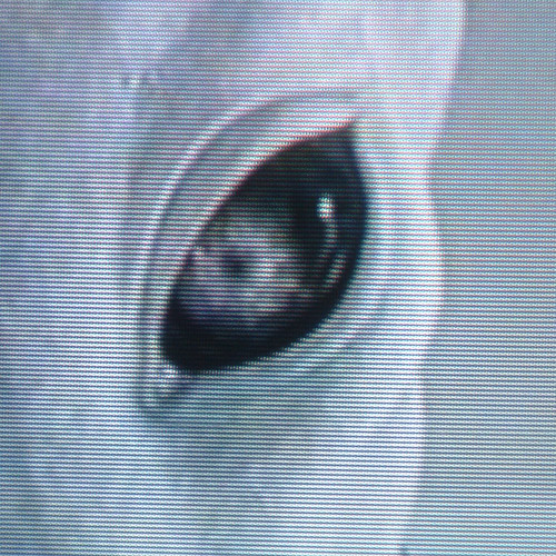
<aslak> what about #4 in a bit more of a alien eye shape.. http://farm4.static.flickr.com/3292/2670212333_4633cbaaca.jpg?v=0 ish
<cweaver> ah, that might be nice, sure.
Okay, thanks Aslak, we'll be in touch.
<aslak> cweaver, thanks, nice work!
<cweaver> Sure thing
Adios :)