-
1. Re: What do you think of Heat Maps as a visualization method for large domains?
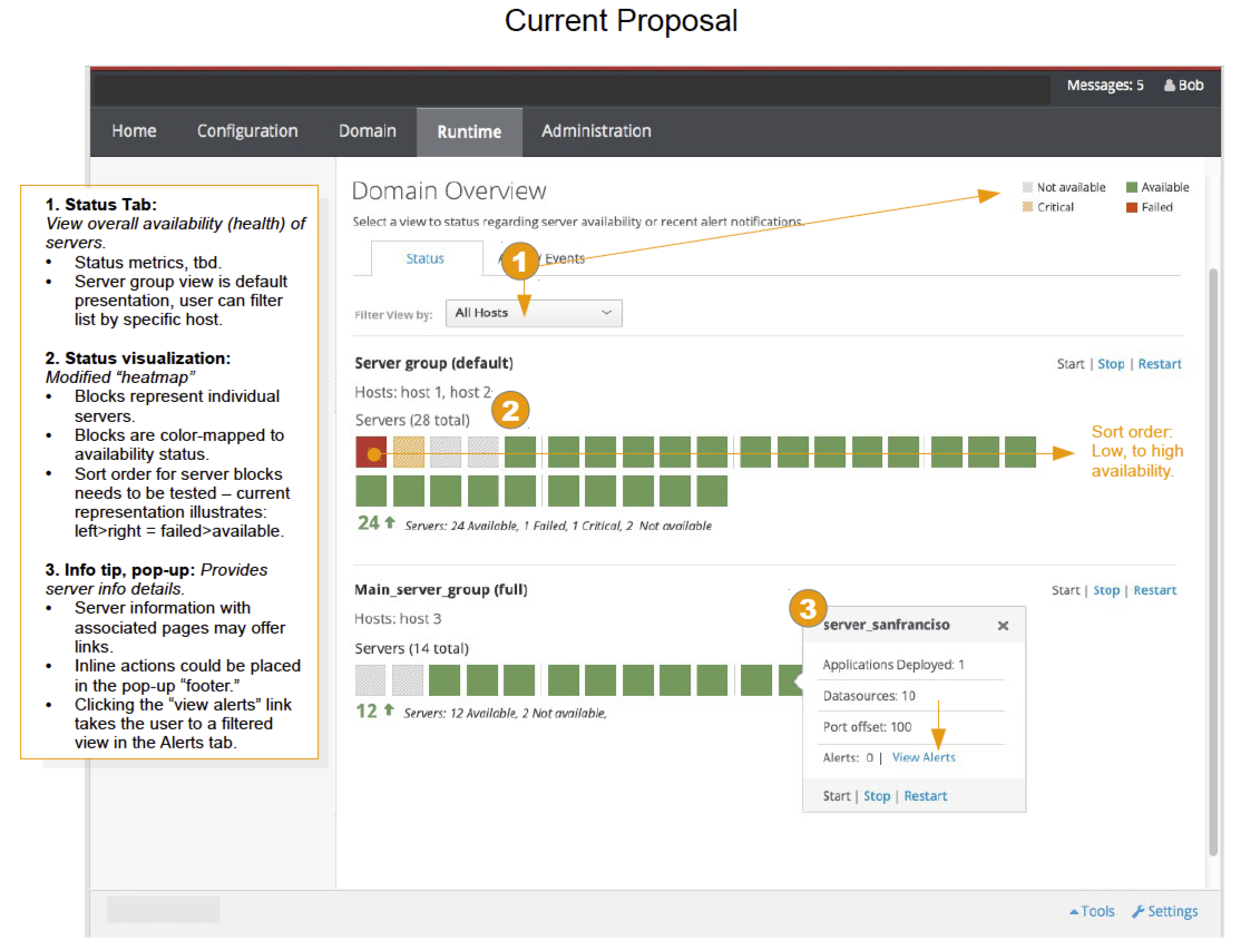
claudio4j Jul 27, 2014 7:09 PM (in response to jason.greene)The visualization of domain in the page "current proposal" and "alerts" are intuitive to understand. Would be nice to show the server names (perhaps in light gray) under each box, so the user can quickly look at the server without clicking at the server. Is the popup box (displayed the server information) activated on mouse click or hover ?
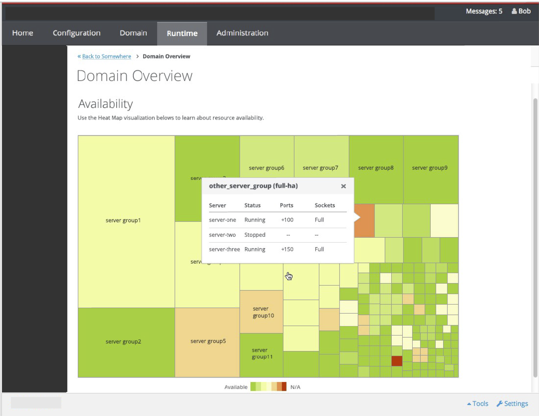
About the heatmaps, I found it not much helpuful for this domain scenario, the different box sizes makes it confusing.
Also, I suggest to add a behavior to the server initialization process, when the server is started depending of the number of applications deployed it can take one or two minutes to be ready, perhaps adding an animated gif to let user know that server is in initialization status.
This is a great improvement to the visualization of a domain servers. Appreciated.
-
2. Re: What do you think of Heat Maps as a visualization method for large domains?
czacharym Sep 15, 2014 10:51 AM (in response to jason.greene)It would be great to see the admin console redesigned, including the log-in page. That popup log-in doesn't reflect how great Wildfly/EAP are. The current Wildfly/EAP admin/management console seem very elementary compared to WebSphere and WebLogic. Perhaps a page out of the Weblogic book could be taken as a reference for redesigning the Wildfly/EAP consoles.

