Whether you use RichFaces 4 in an existing application or you’re just starting a new project, this article will guide you through the steps for building a mobile JSF 2 application with RichFaces 4.2.1.
Getting Started
Step 1
The first thing one should understand when working with a mobile web application is that HTTP requests are the enemy. This means any external file requests like JavaScript, CSS, and images are slowing your application down in a mobile environment. Not only that, but when you link to another page and force the browser to refresh, you’re starting all over again with the slow wait times - and overall bad user experience.
By adding the following to your web.xml...
<context-param>
        <param-name>org.richfaces.resourceOptimization.enabled</param-name>
        <param-value>true</param-value>
</context-param>
you now have all the out-of-box JavaScript and CSS combined into just a few optimized files. This is the only XML setting required by the framework to make your RichFaces 4.2.1 application mobile friendly.
Step 2
To initialize the JavaScript and CSS which allows RichFaces to function on a mobile device, you must insert the following code in your template:
Note - Ensure you copy the physical .js and .css files locally before developing your application.
<link rel="stylesheet" href="https://raw.githubusercontent.com/richfaces4/components/master/mobile-compatibility/slidfast.css" />
<script type="text/javascript" src="https://raw.githubusercontent.com/richfaces4/components/master/mobile-compatibility/slidfast.js"></script>
<script type="text/javascript">
slidfast({
defaultPageID:'home-page', //required. the ID of your default page
callback: 'handleHashChange', //optional. a javascript function to call after navigation happens (typically your a4j:jsfunction method)
backButtonID: 'back-button' //optional
});
</script>
This snippet will setup the required default parameters to get your app running:
defaultPageID (required) is the actual ID of the HTML element (div) surrounding your code for the home page. It is the only required parameter.
callback (optional) can be any javascript function to call after a location.hashchange event occurs. When using with RichFaces, this would be the method you have defined in your a4j:jsFunction component.
backButtonID (optional) is the ID attribute of the application’s back button. However, this parameter is optional since the the mobile JavaScript (slidfast) already accounts for use of the browser back and forward buttons.
Step 3
After initializing the mobile front-end, you must ensure your markup is in proper order. At a minimum, you are required to adhere to the following markup structure. This gives us the same framework in which the RichFaces mobile showcase has been thoroughly tested and checked for bugs on multiple mobile devices.
<h:body>
<!--Include the css just after the body tag to ensure we overwrite dynamic styles-->
<link rel="stylesheet" href="https://raw.githubusercontent.com/richfaces4/components/master/mobile-compatibility/rf-mobile-skin.css" />
<div id="browser">
<header>...</header>
<h:form>
<div id="page-container">
<div id=”home-page”>
… JSF and HTML markup
</div>
<div id=”component-page”>
… JSF and HTML markup
</div>
</div>
</h:form>
</div>
</h:body>
For a complete working example and to see how the page is setup, you can view the source of our showcase application template here or you can run the RichFaces simpleapp archetype with the mobile-optimized switch set to true:
mvn archetype:generate \
-DarchetypeGroupId=org.richfaces.archetypes \
-DarchetypeArtifactId=richfaces-archetype-simpleapp \
-DarchetypeVersion=4.2.1.Final \
-Dmobile-optimized=true
Going Mobile with JSF
Now we’ll review some of the issues which are commonly faced when going mobile with JSF:
- JSF does not inherently allow pass through attributes. Most mobile frameworks, such as jQuery Mobile, depend on this when dealing with HTML.
- It’s important to maintain the native feel of the application. So dealing with back button, bookmarking and overall AJAX support is not naturally inherited by JSF.
- Again, to preserve the native feel of the application, we must force our content to load into a single DOM.
- Minification of JavaScript and CSS
- Orientation, touch, and other viewport specific settings explained below.
To handle these issues, we’ve complemented RichFaces 4 with a lightweight, mobile HTML5 based approach which supports native transitions, back button, bookmarking, and touch support. For now, RichFaces components have only been tested on WebKit based browsers, this includes Mobile Safari and Android.
Best of all, we didn’t touch the component code or renderers, we only added JavaScript and CSS to help take your application mobile. This approach is backwards compatible with any RichFaces 4 application and is built from the ground up to support legacy installations as well as new initiatives.
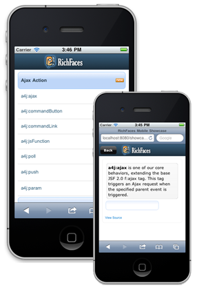
You can download the mobile code used in the RichFaces Mobile Showcase here.
Mobile Web Overview
The mobile web is a daunting scene where HTML5 terminology is thrown around as the solution to everyone’s problem. Many folks are spinning their wheels on ramping-up with yet another “mobile web” framework.
HTML5 is solving many of the mobile web problems, but most of the solutions addressed by the W3C are not yet available within mobile web browsers.
For example, today, Web Sockets is not supported on Android devices but it does work on iOS based devices. This leaves us asking the question: Who supports what, and how do I tie graceful degradation (or fallbacks) into my existing application?
Luckily, RichFaces has us covered. The RichFaces 4 framework allows you to build mobile applications without worrying about what browsers do and don’t support. You now have components like a4j:push, which allow you to support HTML5 features when they exist, and fallback to compatible solutions when the device does not support what you need.
Apart from the complex scenario of varying device features, there are a few basic techniques one can use in any mobile web application to support features such as orientation changes (landscape or portrait), zooming, and other device specific settings.
Viewport Metadata
The viewport is the area in which your web page is drawn. You can define properties of the viewport for your web page using the "viewport" property in an HTML <meta> tag (which must be placed in your document <head>). You can define multiple viewport properties in the <meta> tag's content attribute. For example, you can define the height and width of the viewport, the initial scale of the page, and the target screen density.

Here is the viewport setting we used for the RichFaces Mobile Showcase:
<meta name="viewport" content="width=device-width, initial-scale=1.0, minimum-scale=1.0, maximum-scale=1.0"/>
This allows the application to resize when rotated to landscape or portrait mode and zooms the content appropriately.
Other device browsers may support additional metadata. For example, Mobile Safari supports Apple specific Meta-Tag keys which allow you to set things like full screen mode and adjustments to other native look and feel elements.
<!-- enable full-screen mode -->
<meta name="apple-mobile-web-app-capable" content="yes"/>
<!-- controls the appearance of the status bar in full-screen mode -->
<meta name="apple-mobile-web-app-status-bar-style" content="black"/>
JavaScript
In the RichFaces Mobile Showcase, we made use of as much screen real estate as possible while running in the device browser. To automatically hide the browser URL bar, our code calls the following JavaScript onload.
function hideURLbar()
{
      setTimeout(scrollTo, 0, 0, 1);
}
Device Detection
When building a mobile application, best practice dictates a mobile friendly URL for our users to hit. There are a few options to detect the device which is currently browsing your site so that you can redirect your user to the appropriate mobile URL.
1. Parse the User Agent yourself and write some wild regex to detect the browser.
2. OpenDDR
3. MobileESP
For the RichFaces Mobile Showcase we chose server-side MobileESP. It was simple to just grab the latest version and include it into the project. Here you see a custom MobileESP processor with CDI integration:
@ManagedBean(name="userAgent")
@SessionScoped
public class UserAgentProcessor implements Serializable {

    private static final long serialVersionUID = 1L;
    private UAgentInfo uAgentInfo;

    @PostConstruct
    public void init() {
        FacesContext context = FacesContext.getCurrentInstance();
        HttpServletRequest request = (HttpServletRequest) context.getExternalContext().getRequest();
        String userAgentStr = request.getHeader("user-agent");
        String httpAccept = request.getHeader("Accept");
        uAgentInfo = new UAgentInfo(userAgentStr, httpAccept);
    }

    public boolean isPhone() {
        //Detects a whole tier of phones that support similar functionality as the iphone
        return uAgentInfo.detectTierIphone();
    }

    public boolean isTablet() {
        // Will detect iPads, Xooms, Blackberry tablets, but not Galaxy - they use a strange user-agent
        return uAgentInfo.detectTierTablet();
    }

    public boolean isMobile() {
        return isPhone() || isTablet();
    }
}
Then, in our Facelets template, we determined which page should be shown through Expression Language.
<f:view
      xmlns="http://www.w3.org/1999/xhtml"
      xmlns:h="http://java.sun.com/jsf/html"
      xmlns:f="http://java.sun.com/jsf/core"
      xmlns:c="http://java.sun.com/jsp/jstl/core"
      xmlns:ui="http://java.sun.com/jsf/facelets">

    <c:choose>
        <c:when test="#{userAgent.phone}">
            <ui:include src="phoneHome.xhtml">
                [phone]
            </ui:include>
        </c:when>
        <c:when test="#{userAgent.tablet}">
            <ui:include src="phoneHome.xhtml">
                [tablet]
            </ui:include>
        </c:when>
        <c:otherwise>
            <ui:include src="desktopHome.xhtml">
                [desktop]
            </ui:include>
        </c:otherwise>

    </c:choose>
</f:view>
AJAX and Mobile Transitions
Next, let’s talk about the recommended way for laying out mobile web pages with RichFaces. Most mobile frameworks prefer you to put all your application content within a single HTML DOM. This means all your web pages are stored within a single HTML page so that when your user visits a new page, the mobile web application acts like a native application and uses hardware acceleration to transition or slide to the next page. This native-like effect cannot be used with a page refresh, so we must use AJAX to include our content dynamically. This approach also improves latency as we are not making a new page request.
For the RichFaces Mobile Showcase, we used a few core JSF 2 components. As mentioned in this blog post, there is good reason why we layout the page with the following structure:
<h:form>
<some navigation menu component>
<f:ajax render="@form"/>
</some navigation menu component>
<ui:include src="#{a dynamically generated URI}" />
<h:form>
With this approach we are accounting for potential hazards with nested forms. If you are taking an existing RichFaces application mobile, you will probably have existing forms on pages you now wish to include. However, we recommend to design your application without using nested forms if possible.
The main point behind this code is to never leave the page you’re on, and load the content into the DOM dynamically. This allows for hardware accelerated page transitions on mobile devices.
The page transition must happen after the AJAX request has completed.

With JSF and RichFaces AJAX driven components you have the oncomplete attribute which is called after the response is received. Here we use the “slidfast” namespace, which is the JavaScript used for our mobility enhancements.
<a4j:jsFunction name="handleHashChange" render="@form" oncomplete="slidfast.slideTo('component-page')">
For more details on hardware acceleration you may want to read HTML5 Techniques for Optimizing Mobile Performance. It explains, in detail, the same techniques we used in the RichFaces Mobile Showcase in regards to CSS and JavaScript.
Bookmarking and Back Button Support
Building on the previous example, we use RichFaces 4’s a4j:jsFunction component to give us access to the JSF lifecycle and page loading. This allows us to use JavaScript to manipulate the location.hash to give our pages back button and bookmarking support when using AJAX based transitions.
As mentioned in this blog post, we’re adding the a4j:jsFunction component to the same form (from our example above) which includes our navigation and dynamically included content:
<h:form>
<a4j:jsFunction name="handleHashChange" render="@form" oncomplete="slidfast.slideTo('component-page')">
<f:param name="demo" value="param1"/>
<f:param name="sample" value="param2"/>
</a4j:jsFunction>
<some navigation menu component oncomplete="location.hash='#{id}:#{currentSample.id}'">
<f:ajax render="@form"/>
</some navigation menu component>
<ui:include src="#{a dynamically generated URI}" />
<h:form>
In the above example, we have assembled all of our code snippets into a single, AJAX driven, RichFaces mobile page.
When a hashChange event occurs (as we have specified above in the "oncomplete" attribute of our navigation component), we call our JavaScript method handleHashChange() (shown above) which has been exposed by the a4j:jsFunction component. This in-turn submits the JSF form with the appropriate parameters and populates the necessary members in our backing bean. Once the AJAX response has completed, we call the JavaScript method in the oncomplete attribute of a4j:jsFunction - this slides our page to the newly updated view giving the user a seamless, native-like user experience.
As you can see, this guide covers the problems faced when going mobile with JSF 2 and RichFaces 4. We also removed some components from the RichFaces Mobile Showcase which were not mobile ready. For example, rich:tooltip, rich:extendedDataTable, rich:jquery, and rich:popupPanel either did not make sense in a mobile environment or needed a heavy rewrite for touch interfaces.
rich:dragDrop however, does work on iOS’ Mobile Safari, but not on Android. To use rich:dragDrop in Mobile Safari browsers, you can include this snippet of JavaScript at the bottom of your JSF template.
If you can think of any other issues we haven’t covered, please discuss them on the RichFaces forums or the #richfaces irc channel.
Comments